


Simplicity is the ultimate sophistication
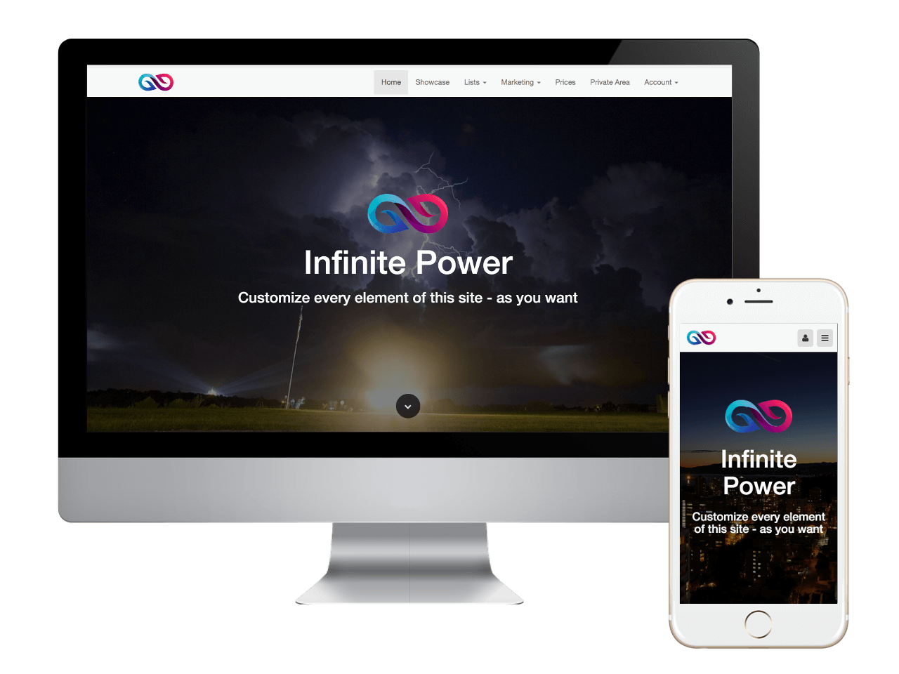
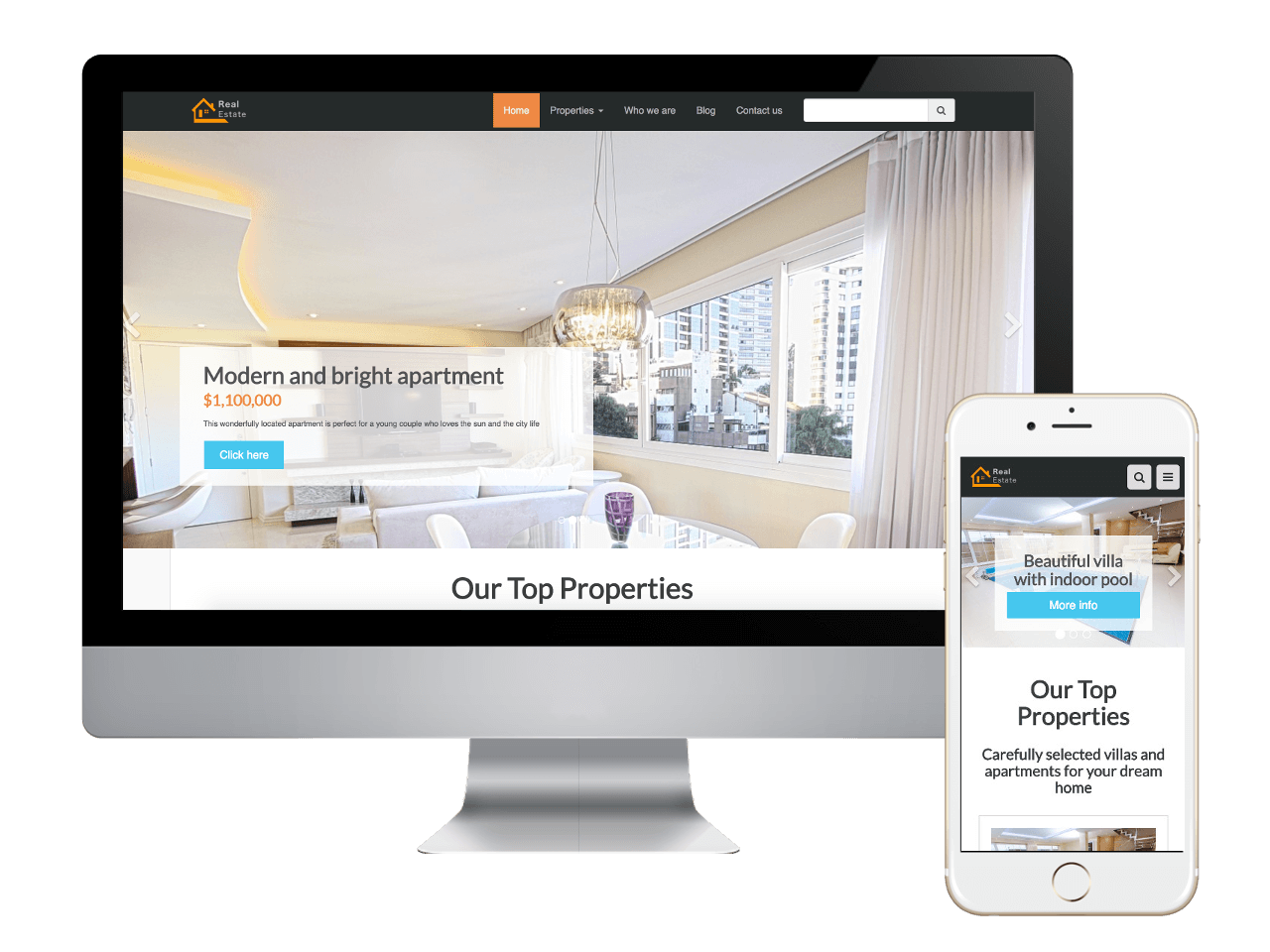
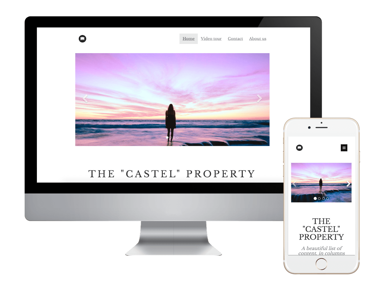
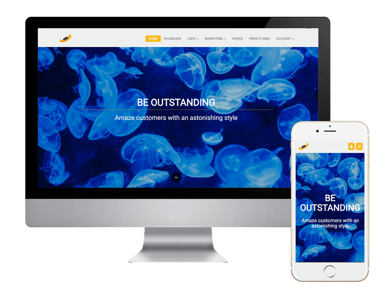
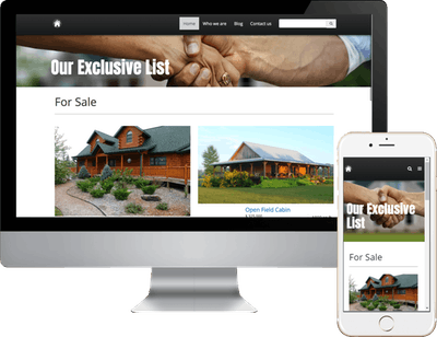
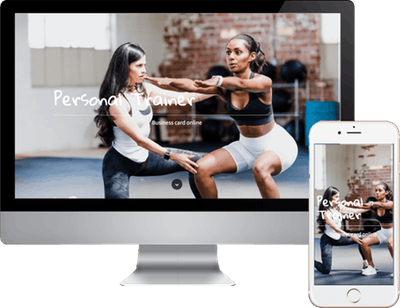
Created to Meet or Exceed Google's Mobile First Best Practices... The mobile-first approach is exactly as it sounds: designing for the smallest mobile screen and working your way up to tablets, ipads, laptops and desktop computers. Our sites are built with an adaptive design. This basically means that our system has created a website and webpage layout designed for each type of mobile device, tablet and desktop system.
Our system adapts to the screen size of the visitor.
When a search is done, our system recognizes the device as a mobile phone, a tablet or desktop, and presents the perfect website or webpage for that specific device.
In the past, and even today, virtually every system creates a website for the desktop first. Then it 'resizes, or reduces' that page down to fit a mobile device, table or laptop. This resizing slows down the delivery to your visitors, and depending on how slow the site is presented, you could potentially lose a customer.

Leave us a Review!

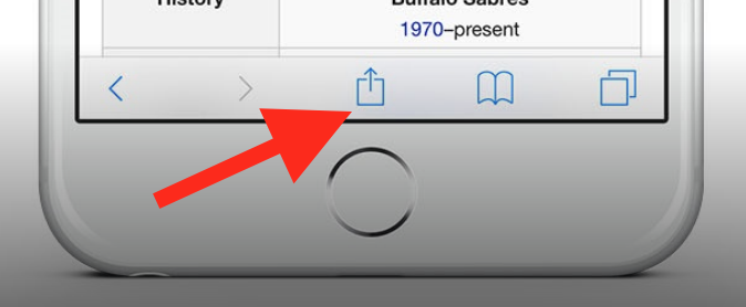
To add this web app to your homescreen, click on the "Share" icon
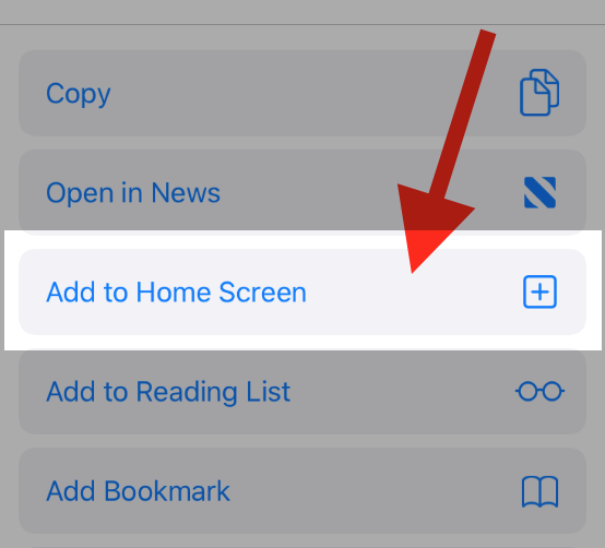
Then click on "Add to Home"
To add this web app to your homescreen, click on the "Share" icon
Then click on "Add to Home"
It looks like your browser doesn't natively support "Add To Homescreen", or you have disabled it (or maybe you have already added this web app to your applications?)
In any case, please check your browser options and information, thanks!
It looks like your browser doesn't natively support "Add To Homescreen", or you have disabled it (or maybe you have already added this web app to your applications?)
In any case, please check your browser options and information, thanks!